Modernizing product discovery through scanability and advanced filtering.
THE OUTCOME
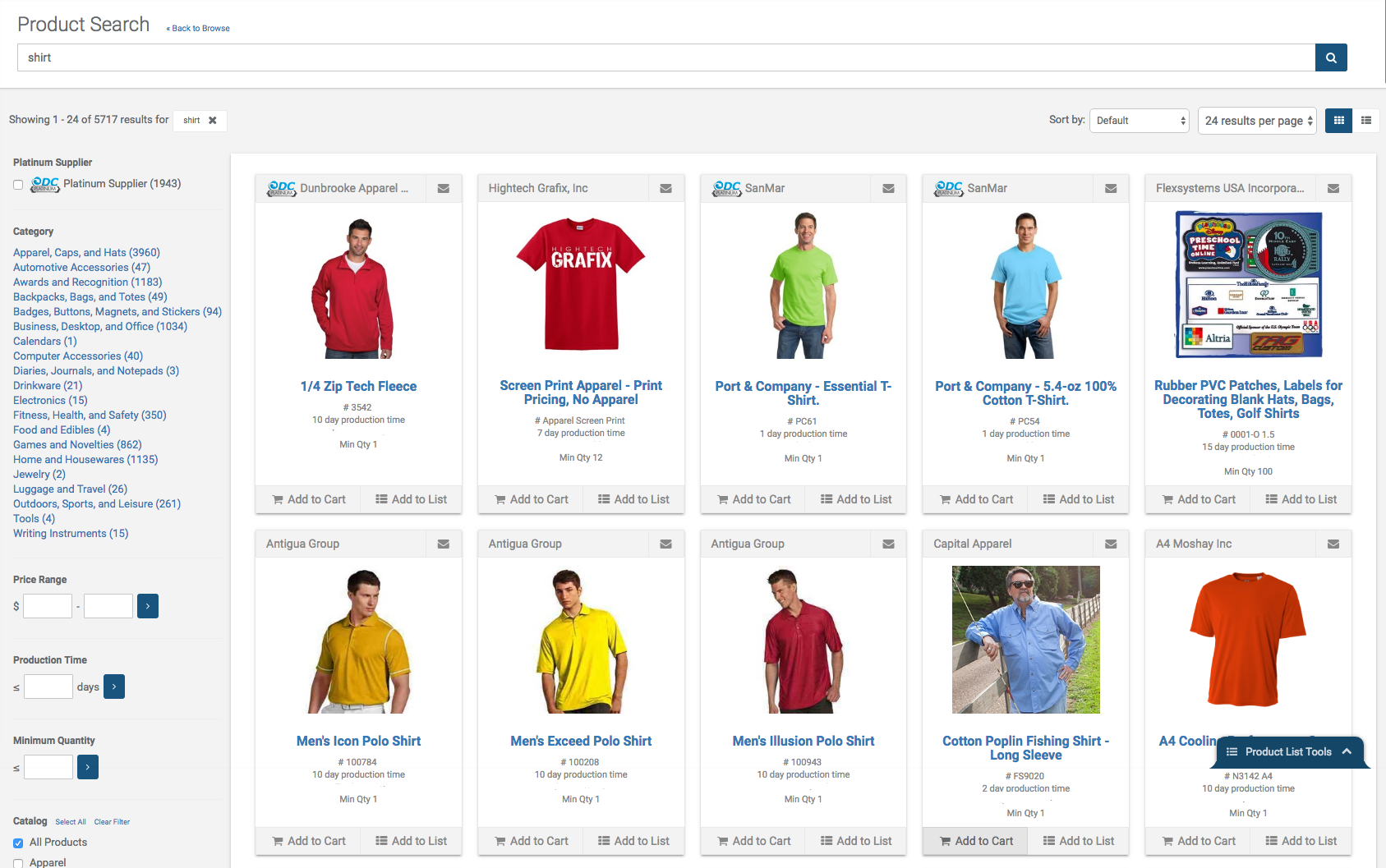
The redesigned search interface successfully introduced a robust filtering system and a mobile-optimized layout without disrupting the workflow of long-time users. By prioritizing white space and visual hierarchy, the new UI significantly improved scanability. This resulted in a faster path to product discovery and a more intuitive experience across all devices.
Project Snapshot
- Role: Lead UI/UX Designer
- Focus: Information Architecture, Mobile Responsiveness, Visual Hierarchy
- Deliverables: Wireframes, Heuristic Audit
The Challenge
Our users were deeply accustomed to the existing search interface, which had become dated and difficult to navigate. The primary challenge was to introduce a modern “look and feel” and complex filtering options without creating a jarring experience. We needed to increase white space and readability while keeping the core functionality recognizable for our most loyal customers.
The Process
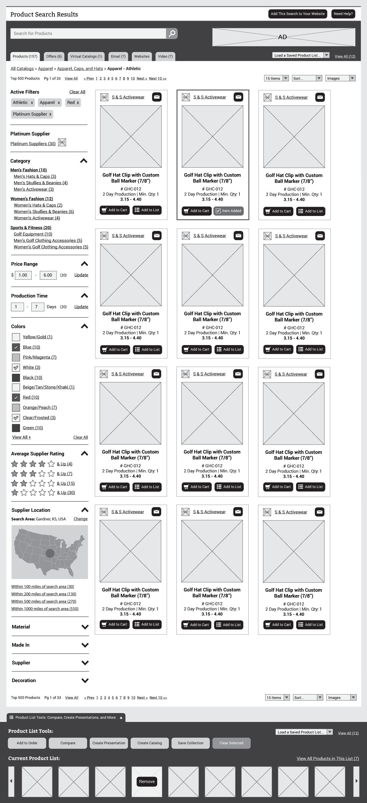
I began the project by researching industry standards for product card layouts and sidebar filtering. My goal was to identify patterns that felt contemporary yet intuitive. I developed wireframes that focused on the transition from a cluttered list to a clean, grid-based system. This phase was essential for determining the right balance of product information versus visual breathing room.
The Solution
The final design replaced the cramped legacy search with a sophisticated, responsive interface.
- Advanced Sidebar Filtering: I designed a logical filtering system on the left-hand side, allowing users to narrow down results by specific attributes instantly.
- Optimized Product Cards: I redesigned the product cards to highlight key information at a glance, using increased contrast and better typography to improve scanability.
- Mobile-First Scaling: The interface was built to collapse the filtering system into a clean, accessible tray on mobile devices, ensuring the search remained functional on the go.


