Streamlining complex veterinary workflows to drive enterprise growth.
THE OUTCOME
The redesigned medical exam interface was a success for Companion Connect. By demonstrating the new workflow to prospects, the company successfully signed the largest client in its history. Beyond business growth, the new UI significantly reduced customer support tickets and increased overall user satisfaction by simplifying precision data entry.
Project Snapshot
- Role: Lead UI Designer and UX Researcher
- Tools: Figma, Lookback, Airtable, Miro, Azure DevOps, Storybook
- Deliverables: User Research, Wireframes, Interactive Prototypes, UI Design and Design System, Dev Hand-off Notes
The Challenge
The veterinary industry has rigorous requirements for form fields, data presentation, and user permissions. Our existing medical exam interface was fragmented, leading to a high volume of support tickets and frequent requests for new features. The goal was to consolidate this entire experience into a single, intuitive page.
The Discovery Phase
This was one of my first projects after joining the company. I needed a thorough understanding of the current pain points of our veterinary clients, so I gathered outstanding feature request data while other team members did discovery interviews.
Key insights from this phase included:
- Users felt overwhelmed by navigating multiple screens during a single exam.
- Certain data fields required specific permissions that were currently difficult to manage.
- Clients needed a faster way to input data without sacrificing clinical accuracy.
Iterative Design & Testing
I translated our initial findings into low-fidelity wireframes to establish the information architecture. Once the basic structure was validated, I moved into high-fidelity interactive prototypes.
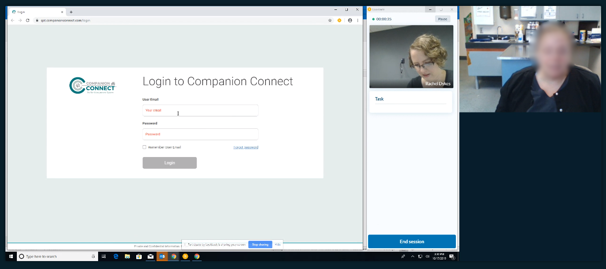
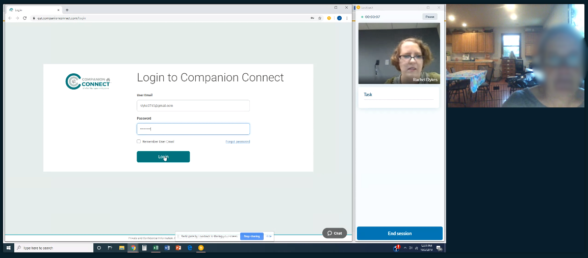
To refine the experience, I conducted one-on-one user testing sessions via Lookback. These sessions allowed me to:
- Observe real-time behavior: I watched how clients interacted with the prototype and flagged insightful moments for the team.
- Collaborate live: Team members observed sessions silently and provided follow-up questions via chat.
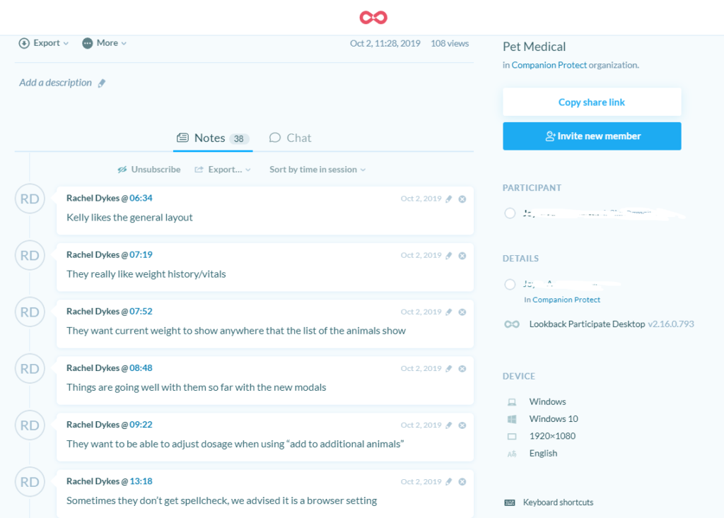
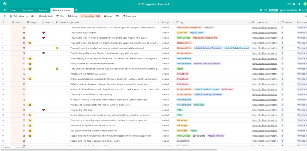
- Quantify feedback: I exported session annotations into Airtable, tagging comments as positive, negative, or feature requests. This system allowed us to track satisfaction levels and identify our most insightful beta testers.
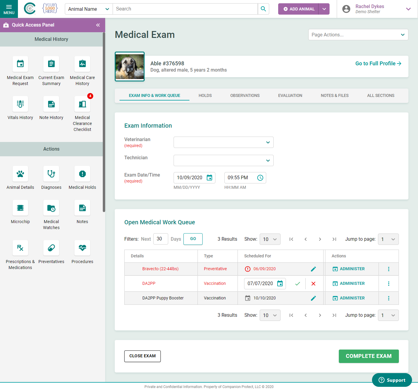
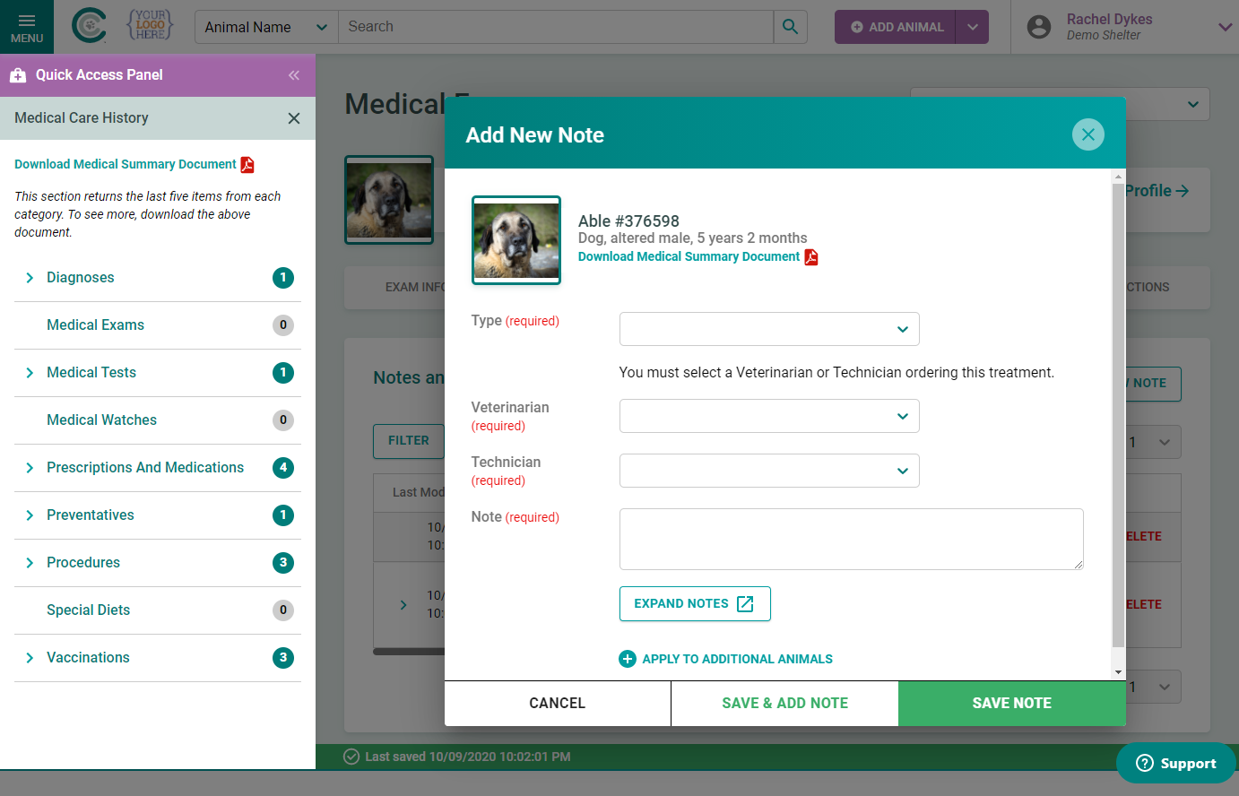
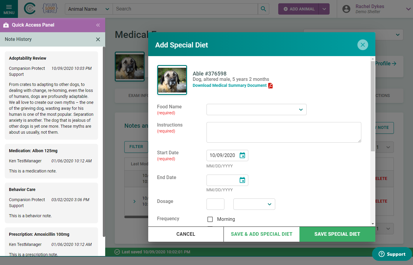
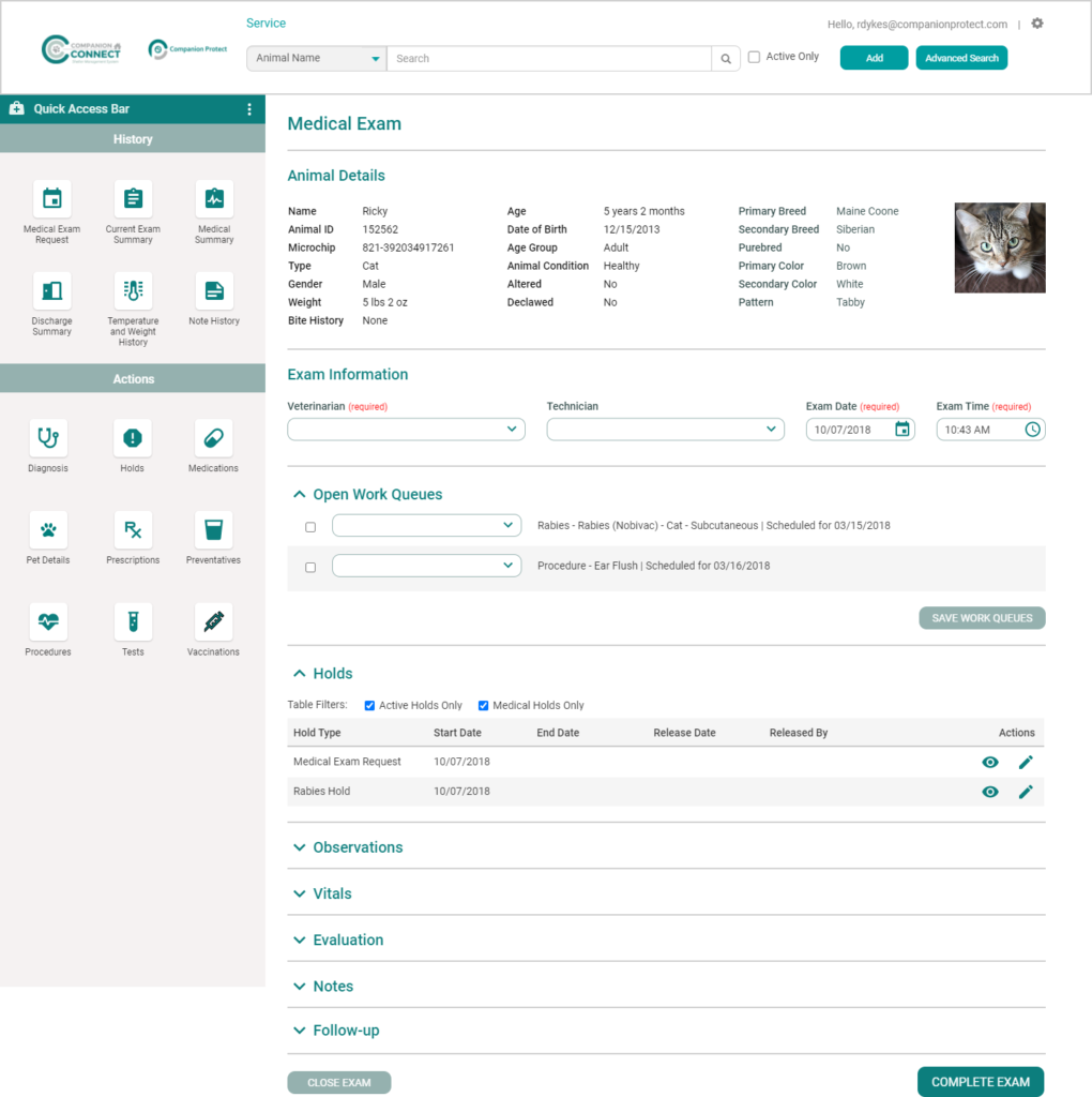
The Solution
The final UI provides a comprehensive, one-page solution for medical examinations. By prioritizing the most frequently used fields and streamlining the visual hierarchy, we removed the cognitive load associated with the previous multi-page process.
Key Features:
- All-in-one layout: Eliminated page jumps to keep the examiner focused on the animal.
- Left panel actions: Created a two-column layout with buttons and icons to perform actions. The panel can switch to a notes view on the left.
- Feedback-driven UI: Refined every interaction based on direct feedback from the clients who use the tool daily.
The Design System
Note: for a look at the design system I created for this project, please see this page.
Final Results
The project concluded with high praise from our existing user base. More importantly, the new medical exam workflow became a centerpiece of our sales demonstrations. Its intuitive design and clear efficiency gains played a pivotal role in landing the largest client in the company’s history. This redesign proved that investing in user experience is a direct driver of enterprise-level business success.