THE OUTCOME
The redesign transformed a cluttered, legacy e-commerce site into a streamlined shopping experience. By prioritizing visual hierarchy and mobile responsiveness, we saw a significant decrease in bounce rates and a smoother transition from product discovery to checkout.
Project Snapshot
- Role: Lead UI Designer
- Tools: Figma, Google Analytics, Shopify Theme Editor
- Focus: Conversion Rate Optimization (CRO), Visual Identity, Mobile-First Design
- Deliverables: UI Best-Practice Suggestions and UI Mockups
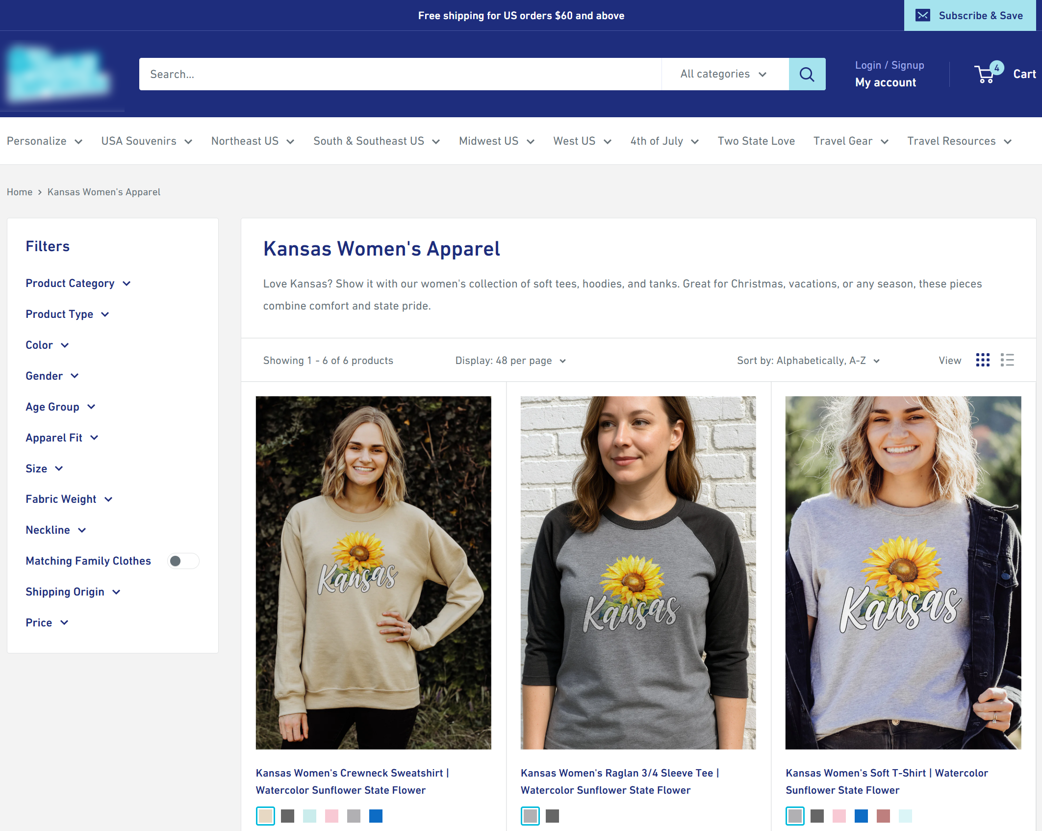
The Challenge
The original website suffered from “information overload.” A confusing navigation structure and a lack of clear calls-to-action (CTAs) made it difficult for users to find products or complete a purchase. The goal was to strip away the noise and create a sophisticated, trustworthy brand presence that felt as premium as the products themselves.
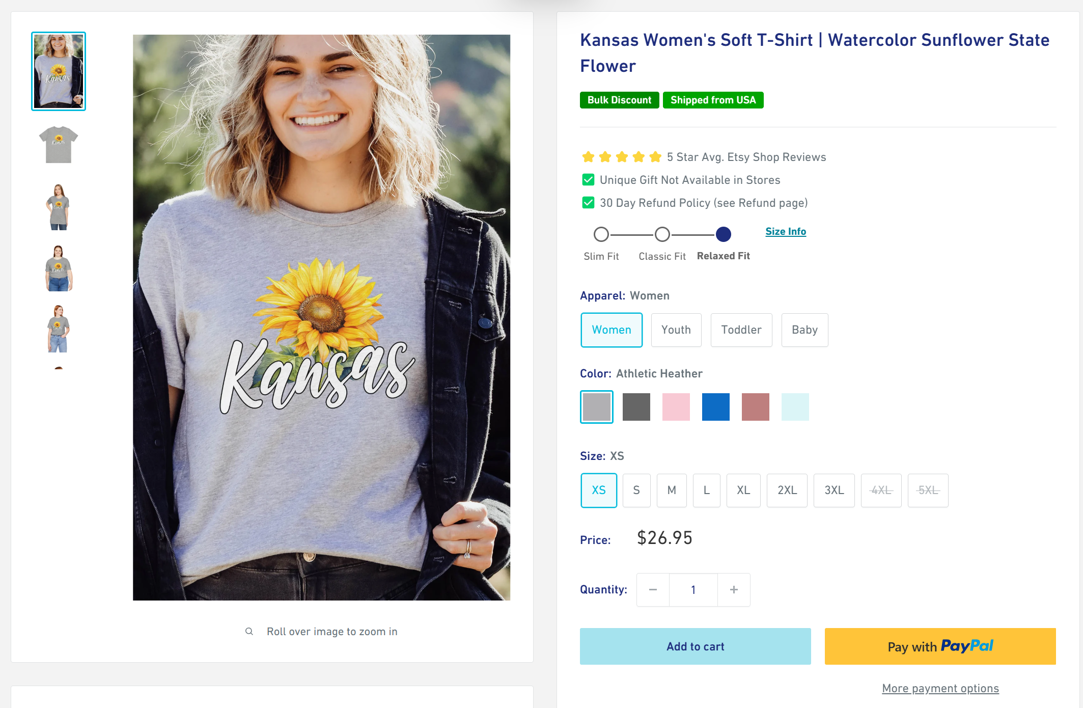
The Solution
I restructured the site architecture to prioritize the user’s intent, ensuring that the most popular categories were accessible within a single click. Used Google Analytics to view the users’ journey/funnel. Also looked at competitor websites to discern other inspiration for layouts.
Key Features:
- All-in-one layout: I reduced top-level menu items to core categories.
- Mini info blocks: High-quality imagery was paired with concise, benefit-driven copy. Also included a small UI area to showcase if the apparel was a slim fit, true to size, or a relaxed fit, with a link to the size chart.
- Expanded Filters: Added more product attribute information so that users can filter down by even more features as needed.