
THE OUTCOME
The implementation of this design system reduced design-to-development handoff time and eliminated UI inconsistencies across four major product modules. By establishing a single source of truth, the product team could ship new features significantly faster while maintaining a cohesive brand identity.
Project Snapshot
- Role: Lead UI Designer
- Tools: Figma, Azure DevOps, Storybook
- Focus: Component Architecture, Documentation, Cross-functional Governance
The Challenge
As the product expanded, different teams began building similar components from scratch. This led to a disjointed user experience and a heavy burden on the engineering team. We needed a centralized, scalable system to ensure visual and functional harmony across the entire enterprise ecosystem.
The Solution
I led the audit and standardization of our UI, moving away from “one-off” designs toward a modular component library. This process focused on three core pillars:
- Foundations: I established a strict system for typography, color tokens, and spacing to ensure accessibility and brand alignment.
- Component Library: I built a comprehensive library in Figma including buttons, form elements, and complex data tables. Each component was designed with variants to cover all possible states.
- Documentation: I created clear usage guidelines so that designers and developers knew exactly when and how to use each element.
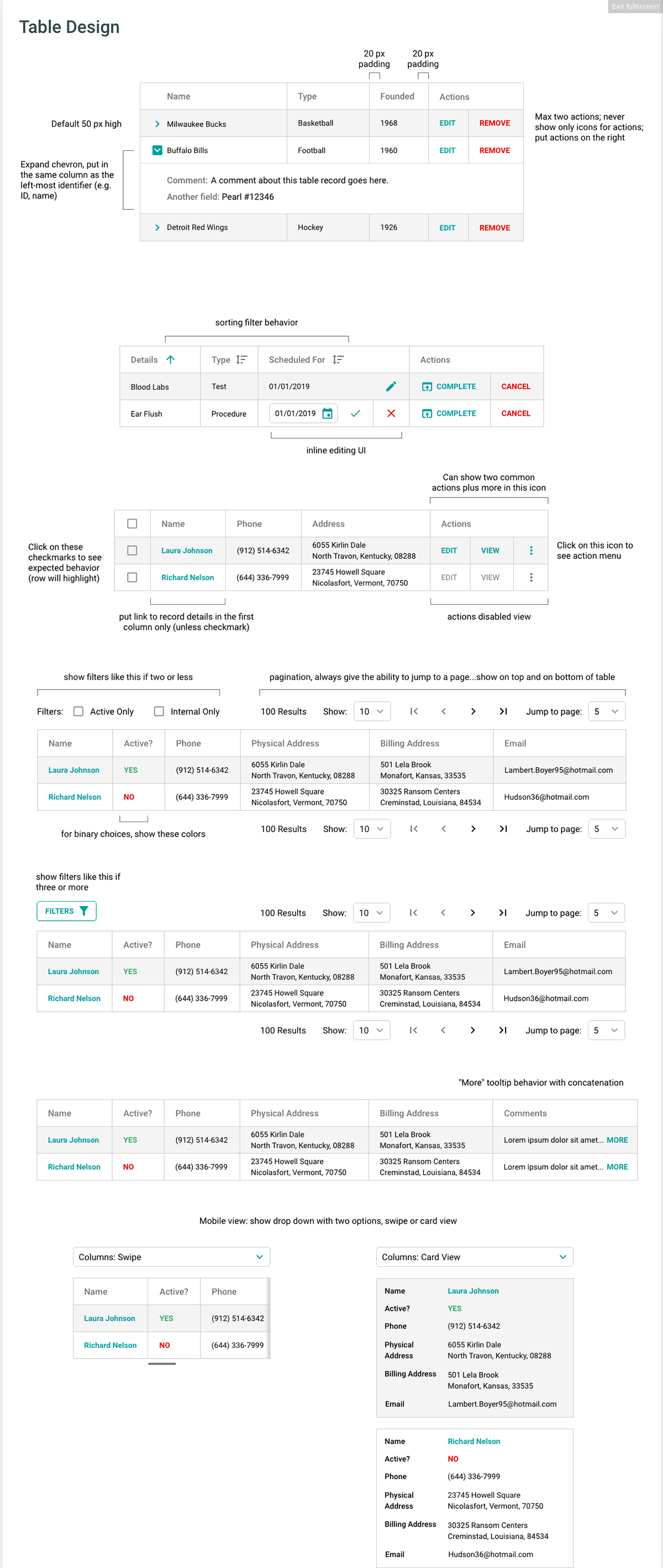
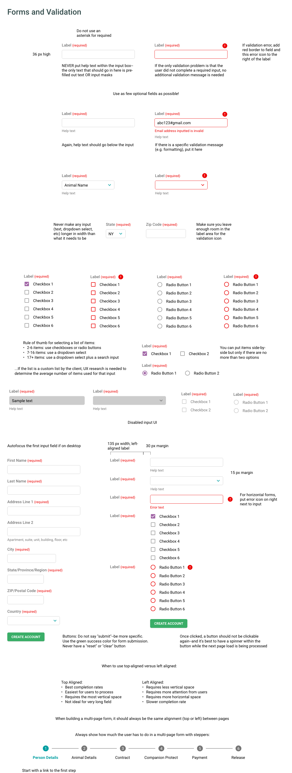
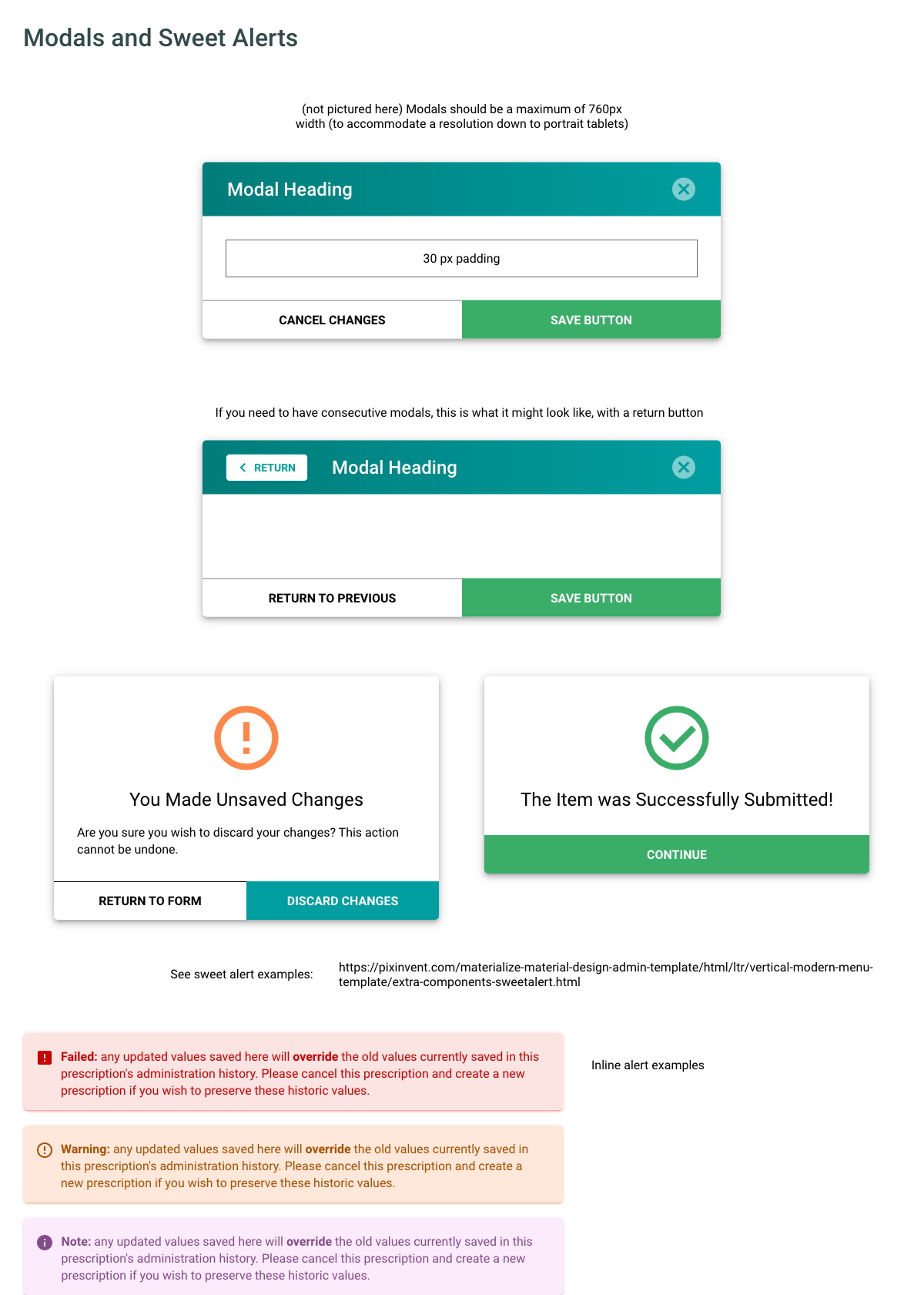
Below are some samples of the notes I created for developers to keep as a reference: