THE OUTCOME
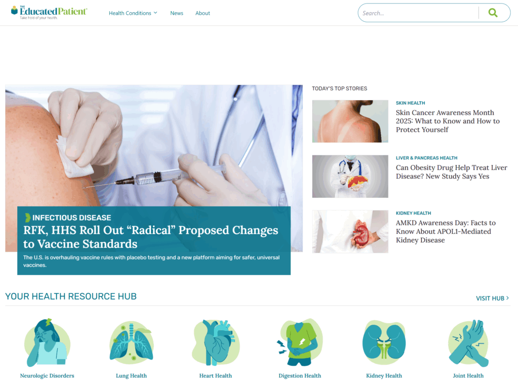
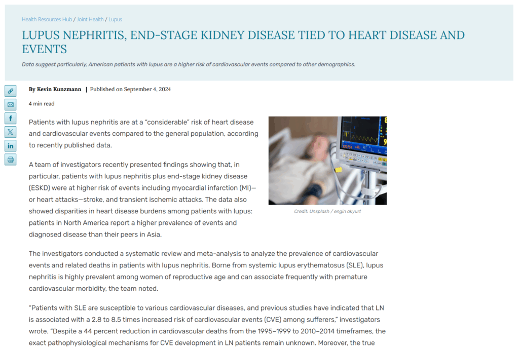
The redesign successfully transformed a dense, overwhelming content library into a navigable and empathetic resource. By implementing a new UI to discover articles and restructuring the information architecture, we saw a measurable increase in time-on-site and a significant decrease in bounce rates. Patients and caregivers reported feeling less “information overload” and found it easier to locate specific treatment guides relevant to their diagnosis.
Project Snapshot
- Role: Lead UI Designer and UX Researcher
- Tools: Figma, Miro, Jira, Hotjar
- Deliverables: User Research and User Journey, Wireframes
- Focus: Information Architecture, Accessibility, Patient-Centric Design, Ad-Integration Strategy
The Challenge
The Educated Patient serves as a vital bridge between complex medical research and the people who need it most. However, the original site was visually dense and difficult to navigate. Users, who are often under significant emotional stress, struggled to find specific resources among hundreds of articles. The goal was to create a calm, organized environment that guided users to the right information without adding to their cognitive load.
The Process
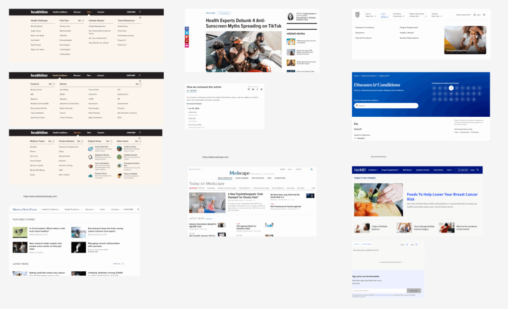
First, I needed to understand what our existing competition in this space did for their website layouts and their UX patterns. I made a mood board:
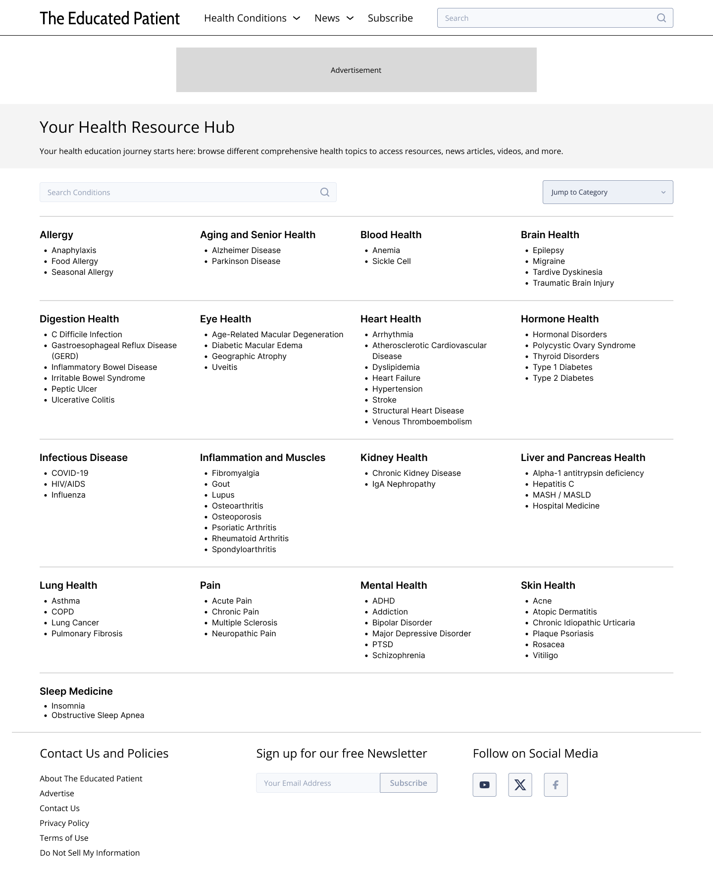
I audited the existing content library to understand how information was being categorized. Through user feedback and heatmap analysis, I identified that the search process was the primary point of friction. From there, I began to work on a wireframe and iterated feedback using it.
The Solution
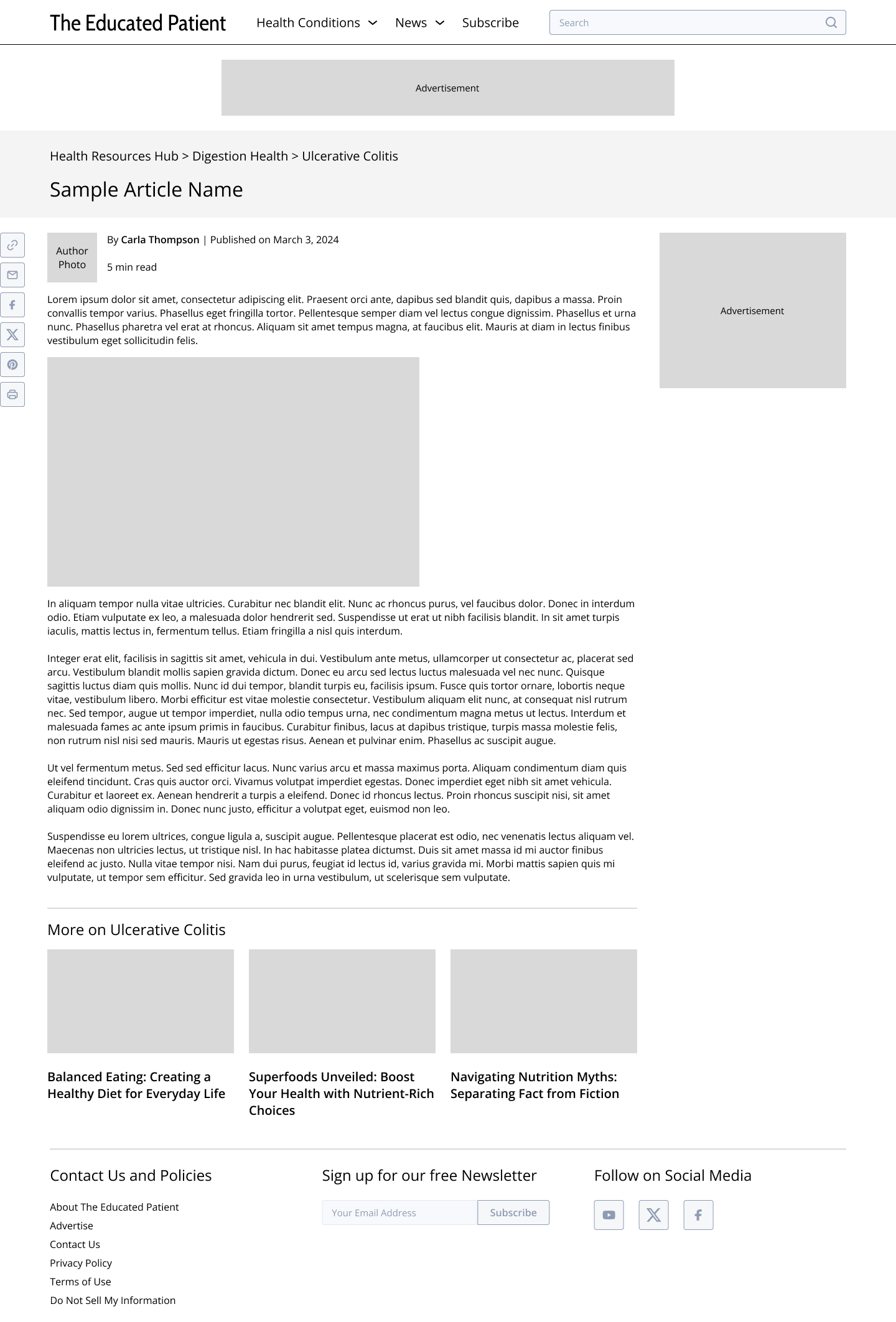
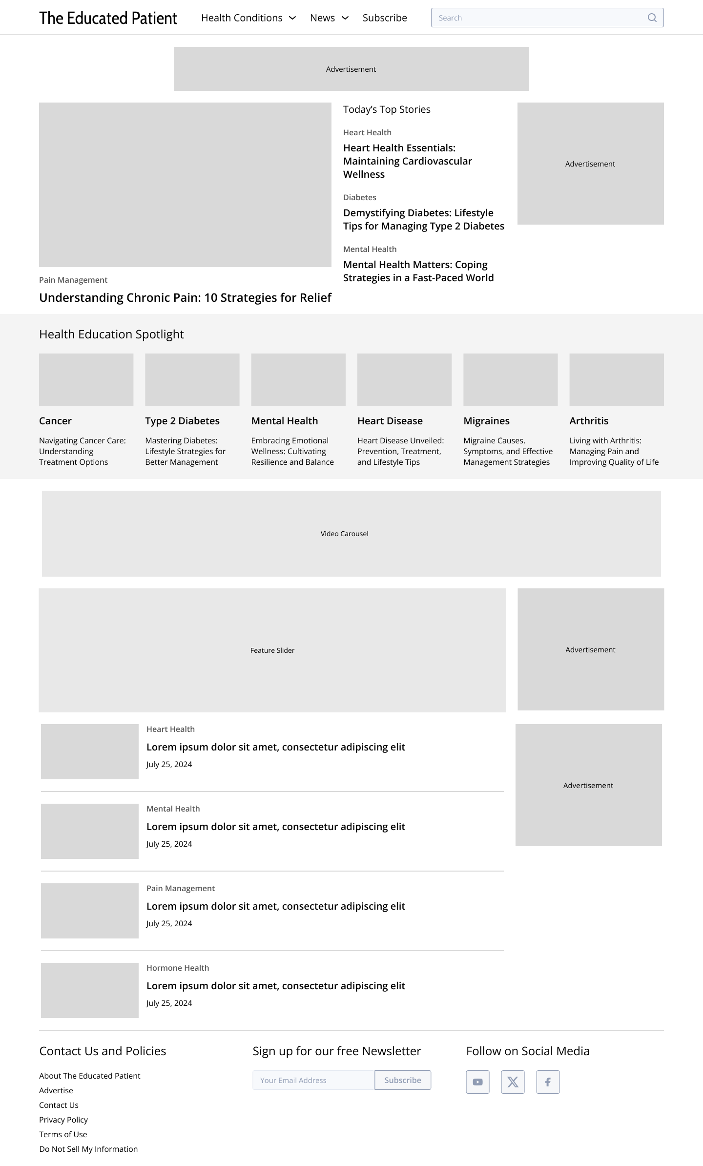
The final design moved away from a traditional blog layout toward a structured resource hub.
Key Features:
- Related Articles: The related articles are integrated more seamlessly, as are ads we are required to show to our audience. We wanted the user to browser more related articles to increase their time on the site.
- Intuitive Hierarchy: I redesigned the article templates to include “Key Takeaways” at the top of every page, allowing users to scan for vital information quickly.
- Cross-Platform Consistency: The mobile experience was optimized to ensure that patients could access resources easily while at the clinic or on the go.
The Impact
The redesign repositioned The Educated Patient as the premier destination for patient-friendly medical news. Using our analytics, we could see that our bounce rate decreased and the time spent on the website increased.
The final design:
