THE OUTCOME
The redesigned dashboard successfully modernized the supplier experience by replacing a dense list of metrics with prioritized, visual data. By implementing a research-based information hierarchy, we reduced cognitive load and allowed users to identify their most important statistics instantly. This led to increased engagement with underutilized platform features and higher overall user satisfaction.
Project Snapshot
- Role: Lead UI Designer and UX Researcher
- Deliverables: User Survey Results, Wireframes
- Focus: Information Hierarchy, Data Visualization
The Challenge
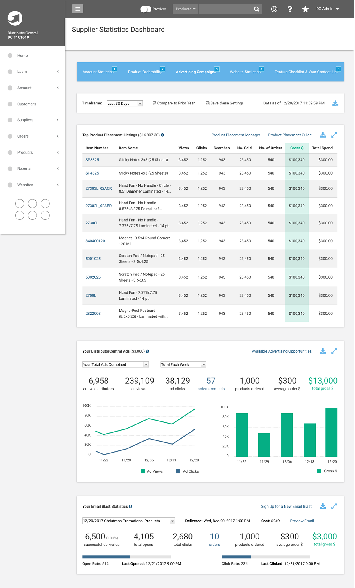
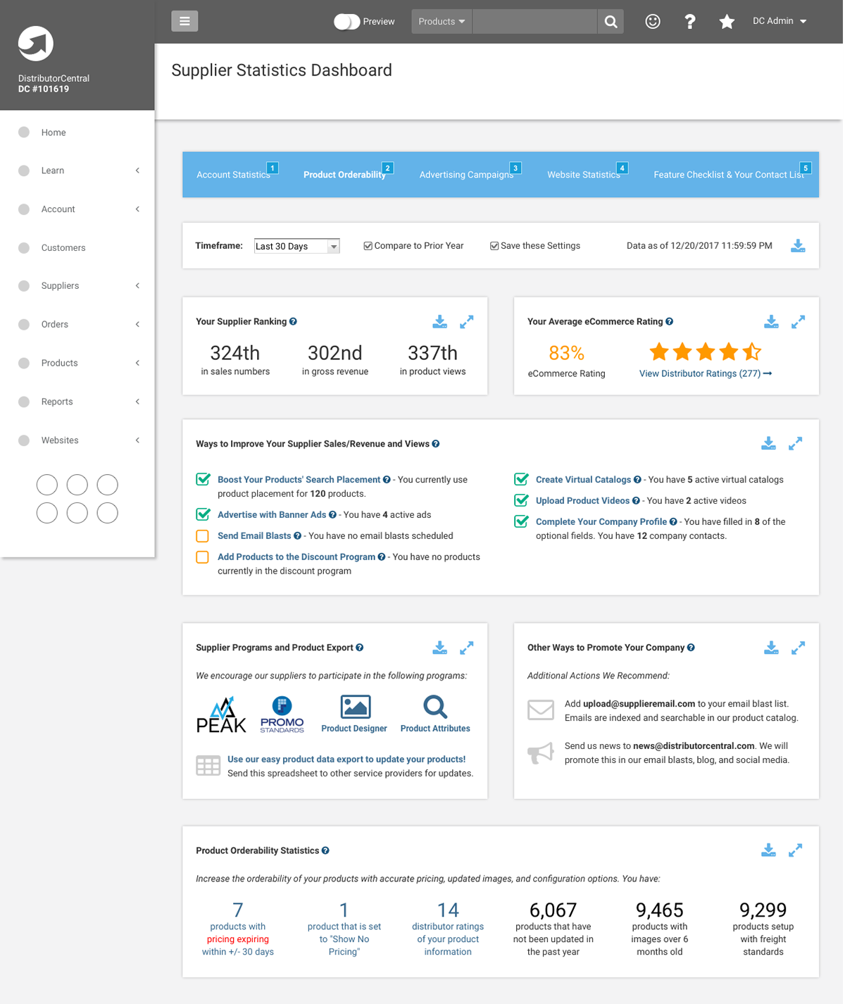
The original statistics dashboard was an overwhelming, long-scrolling list of data without any visual aids or clear hierarchy. Suppliers struggled to find the information they needed because every data point was treated with the same level of importance. The goal was to modernize the interface and highlight the most critical metrics while introducing charts and graphs for better scanability.
The Process
Before designing a single element, I conducted a targeted user survey to understand how suppliers actually interacted with the dashboard. I focused on two key areas:
- Frequency of Use: Determining how often suppliers checked their statistics.
- Prioritization: Asking users to rank existing sections from “Very Important” down to “Not at All Important.”
The survey results were a revelation. I identified a clear disconnect between what was currently emphasized and what the users actually valued. This data allowed me to strip away low-value information and prioritize the sections that drove business decisions for our suppliers.
The Solution
Using the survey results as my guide, I redesigned the dashboard to focus on speed and clarity.
- Visual Data Representation: I introduced intuitive charts and graphs to replace raw numbers, allowing for immediate trend recognition.
- Above-the-Fold Priority: The most important metrics identified by users were moved to the top of the page, eliminating the need for excessive scrolling.
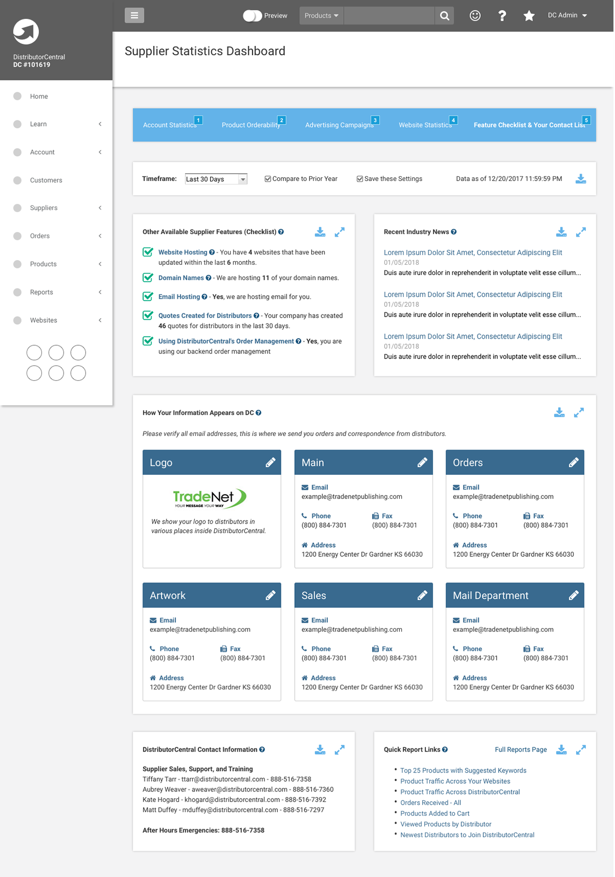
- Sectional Organization: I broke down the remaining information into distinct, readable sections, using white space to prevent the page from feeling cluttered.